TI-84 Guides for Univariate and Bivariate Statistics

Here are some guides I made for my students to help them remember how to use the TI-84 Plus CE (though I think it’s pretty much the same for all TI-84s) to calculate statistics and create graphs for univariate and bivariate data. They’re designed for interactive notebooks, but I’m sure they’d still be useful for teachers who don’t use INBs.

1-Var Page 1: Entering Data and Calculating Statistics

1-Var Page 2: Histograms

1-Var Page 3: Boxplots

2-Var Page 1: Entering Data and Calculating

2-Var Page 2: Scatterplots

2-Var Page 3: Regression

Downloads are here.


Perimeters of Polygons INB Page

I mentioned in my last post that students sometimes describe perimeter as the “outside of a shape” (as opposed to area being the “inside”.) Though it’s an easy answer to give, and an easy answer for a teacher to accept as being correct, I wanted to put my students’ understanding of perimeter on a more sure footing. I wanted to give students a clear definition, showing that when we use the perimeter, we’re talking about a length.

At the same time, the math involved in the perimeter of polygons is pretty simple: its the sum of the lengths of the sides. There’s a reason it’s introduced at third grade (in the Oklahoma standards, at least.) But while adding a set of numbers is pretty easy for a high school student, I wanted to layer in more challenge.

My students need to figure out the missing side lengths of the polygon before they can make that simple calculation. Or, they’ll get the perimeter and have to figure out something else. Given this unit has already covered theorems related to quadrilaterals, and the previous unit was on the Pythagorean theorem, special right triangles and trigonometry, I had lots of options of for how to make students determine the information they need.

Also, students complain all the time about word problems, which tells me they probably need more exposure to and practice with word problems. So I gave my students ten problems, for which they had to draw a diagram (as I hadn’t given them one) and show all their mathematical working.

Downloads are available here.


Areas of Polygons Cut and Paste Activity

One of the biggest challenges in teaching math is allowing students to understand things that are abstract. For instance consider this possible definition for area: “A measure of the two-dimensional space within or occupied by a plane figure or region.” While this seem perfectly serviceable to a math teacher, students may struggle to conceptualize exactly what it means. What exactly does two-dimensional space mean? What does it mean to be “within” a figure or to “occupy” space?

These seem simple, but there are subtleties to understanding what area really is, which I’ve even seen calculus students mess up with. If you ask students what area is, they often respond with something like “area is the inside, and perimeter is the outside,” but then can’t elaborate on that. The common confusion between concepts of length and area is demonstrated by students frequently stating the area of a shape in length units.

This is why I like using the cutting and pasting of paper to represent area. I find students can conceptualize the amount of paper used to make a shape much easier than the abstract idea of “area”, even though they are fundamentally the same thing. Students can understand that one shape has more area than another using the fact that it took more paper to make. Also, if you can demonstrate that two shapes can be constructed from the exact same amount of paper, students can understand that they have equivalent areas.

This activity uses the area of a rectangle to find the areas of other polygons. Students are given a page with templates for the shapes they’re going to create, and a colored half sheet of rectangles and octagons. (The colored half sheet is actually double the number of shapes they need, but it makes things easier to have spares if they make mistakes.)

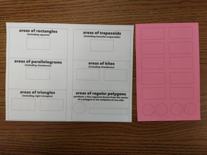
Everyone also needs a glue stick, a pair of scissors, a ruler and a pencil.

The white sheet can be cut into the six separate sections. On the back of each section, there are instructions on how to construct the given shape from a rectangle.

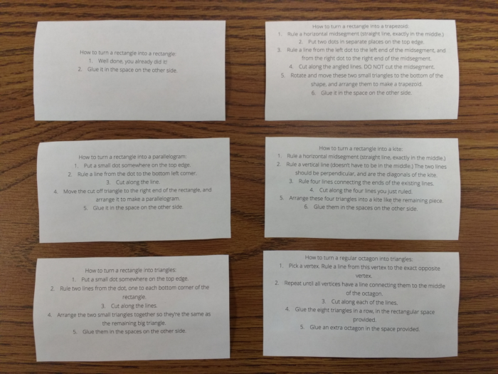
Students should follow the instructions to construct each shape from one of the small colored rectangles. Reactions will range from “this is easy”, to “I think I’ve got it, can I check what you did”, to “this is impossible!” Make sure you’re cycling around the room a lot, because students can and will fall behind quickly if they’re not paying attention. Frustratingly, I found most of the students who thought the instructions didn’t make sense hadn’t actually taken the time to read them step-by-step.

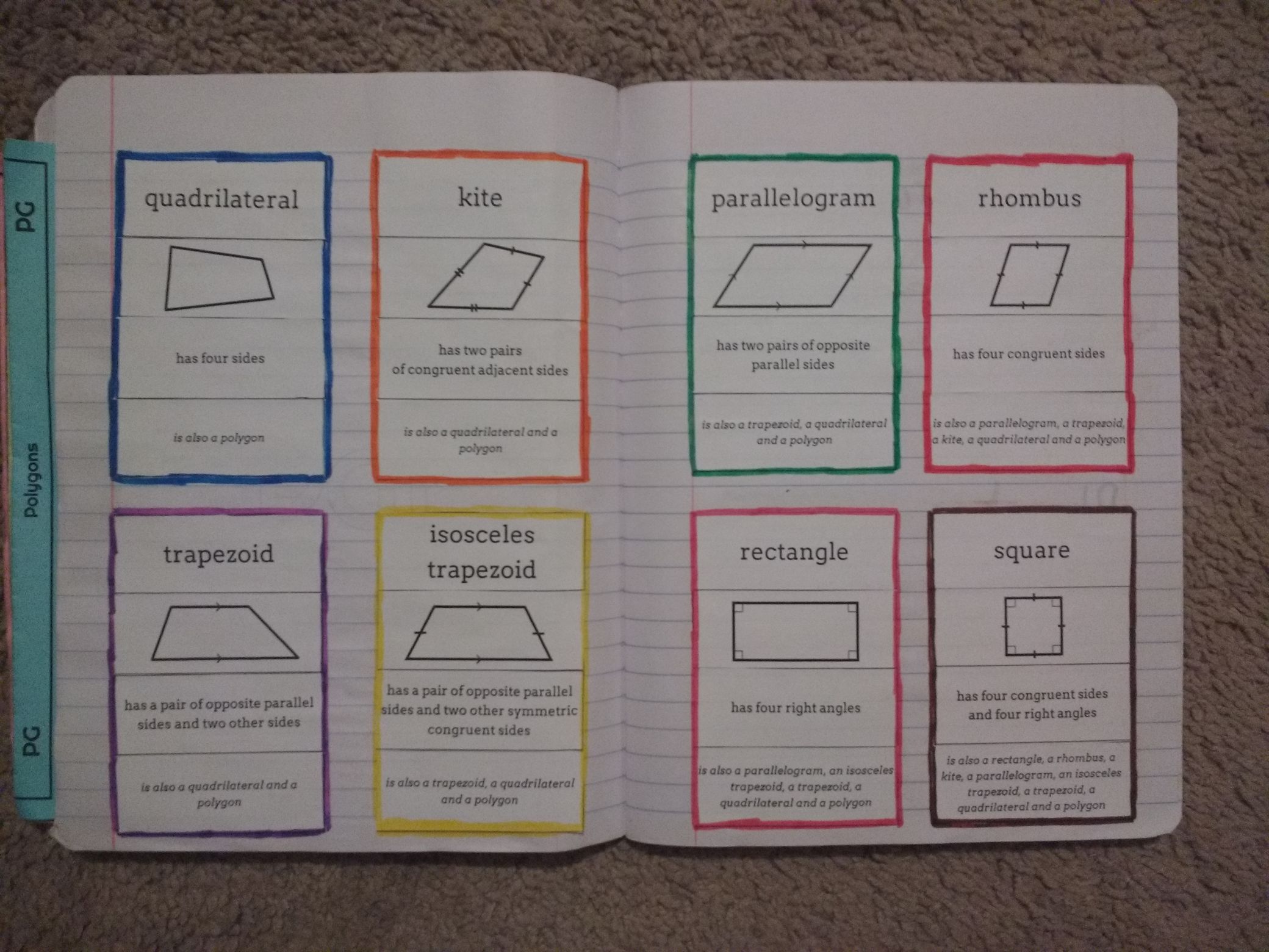
I suggest doing them in the order of rectangle, parallelogram, triangle, trapezoid, kite and polygon. Once they’re done, they’ll look something like this:

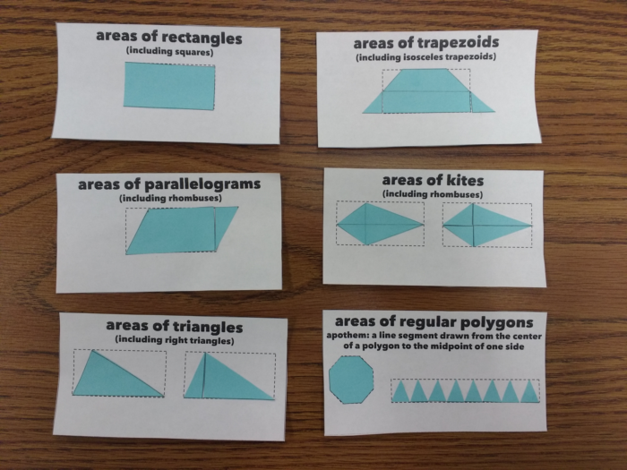
The idea is that each shape has an area equivalent to a rectangle in some way, because they used the same amount of paper. The triangle and the kite are related by a half, because one rectangle was able to make two of these shapes. The regular polygon is a little different, as it starts with the polygon and is deconstructed into half a rectangle; we know it’s half, as we already showed that triangles make the area a half. Add some labels to the shapes, and you get something like this:

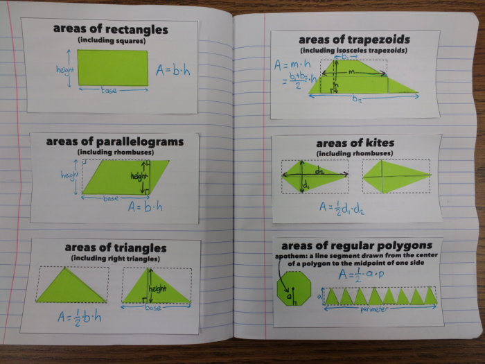
In the trapezoid, “m” is referring to the midsegment (or median) of the trapezoid. We’ve already covered the the theorem that says the midsegment length is the mean of the base length, which is why we’re able to substitute (b1 + b2)/2 for m without any further working.

If you’d like to do this, files can be downloaded here. Included are alternate versions for non-Americans who think “trapezoid” is a weird word. Font is Matiz.


Linear Regression Intro Activity

Today in Statistics we started discussing linear regression. Before getting into the details of how it works, I wanted to help my students understand what we are trying to use it to achieve. That is, creating a linear equation that models bi-variate data.

To start with, I posted this data in Desmos on my smart board:

There’s nothing special about the data, they were just the numbers I happened to type into Desmos at the time. If I was going to do this again in the future, I think I’d want to source some real-world data to use. But as this activity didn’t have a whole lot of preparation go into it, there wasn’t a whole lot of opportunity to find that data. (That said, if you’d like to use my artificially created data, go for it.)

I had students create their own scatter plots for the data. Once they had done this, I told them to rule a line through the data that they thought summarized and modeled the data as well as possible. I informed them that there is an objective way to determine which equation does the best job of this, so it was now a competition.

Then the moment that revealed to us just how rusty some of their algebra skills are: I had them each find the equation of their line. After they complained that it’s been too long since Algebra 1 (despite most of them seeing this in Algebra 2 or Geometry with me last year), and a quick recap tutorial on slope-intercept form, they were able to find their equations.

Then to compare them, I typed their equations into Desmos so that we could visually compare them. I’m happy to say that most of the equations fit the data reasonably well, at least to the naked eye (which is, of course, all my students had to work with for the activity.) Then, I added one more line: the regression equation created by Desmos itself (in orange.)

One of the lines (the blue dashed one) is actually very close! I also changed all of my students’ equations into regression equations, so we could compare their R2 values. For now, I just told them that this is a measure of how well the model fits the data. In future lessons, I will explain the more formal meaning to them.

To finish our discussion, I had Desmos plot the residuals for the linear regression equation, as well as for some of the students’ equations. I explained that what Desmos was doing was trying to make these residuals as close to zero as possible. Over the next few days, we’ll start to get into the details of how the mechanisms of regression actually work. But for this lesson, I wanted to give students a sense of what regression is about, rather than how it works.


Quadrilaterals Card Sort

Here’s a card sort I created for the definitions of the special quadrilaterals.

Each group contains four cards: the name of the quadrilateral, a diagram, the definition, and a list of the other shapes quadrilateral is an example of. The diagram shows only the information that’s stated in the definition. Other properties of the quadrilaterals are covered in the following skills (some of which I’ve already blogged about.)

Downloads are here.