The other day, Sarah showed me this tweet, and told me she wanted to make a poster based on it:
Wonders of the algebraic language
cc @cgironella2005 @mathequalslove pic.twitter.com/Bp8HfmqhDg— yair.es (@notemates) August 6, 2018
She wasn’t sure how she would do it. I tried suggesting an idea I had, but we decided it might be easier if I just made it and let Sarah see what she thought. Turns out that she loved it:
Excited to laminate this poster tomorrow and get it hung up in my classroom! Special thanks to @theshauncarter for making this poster for me after I showed him a tweet from @notemates. #mtbos #iteachmath pic.twitter.com/T5jA5LD1SW
— Sarah Carter (@mathequalslove) August 7, 2018
She did get it laminated today, and it looks like this:
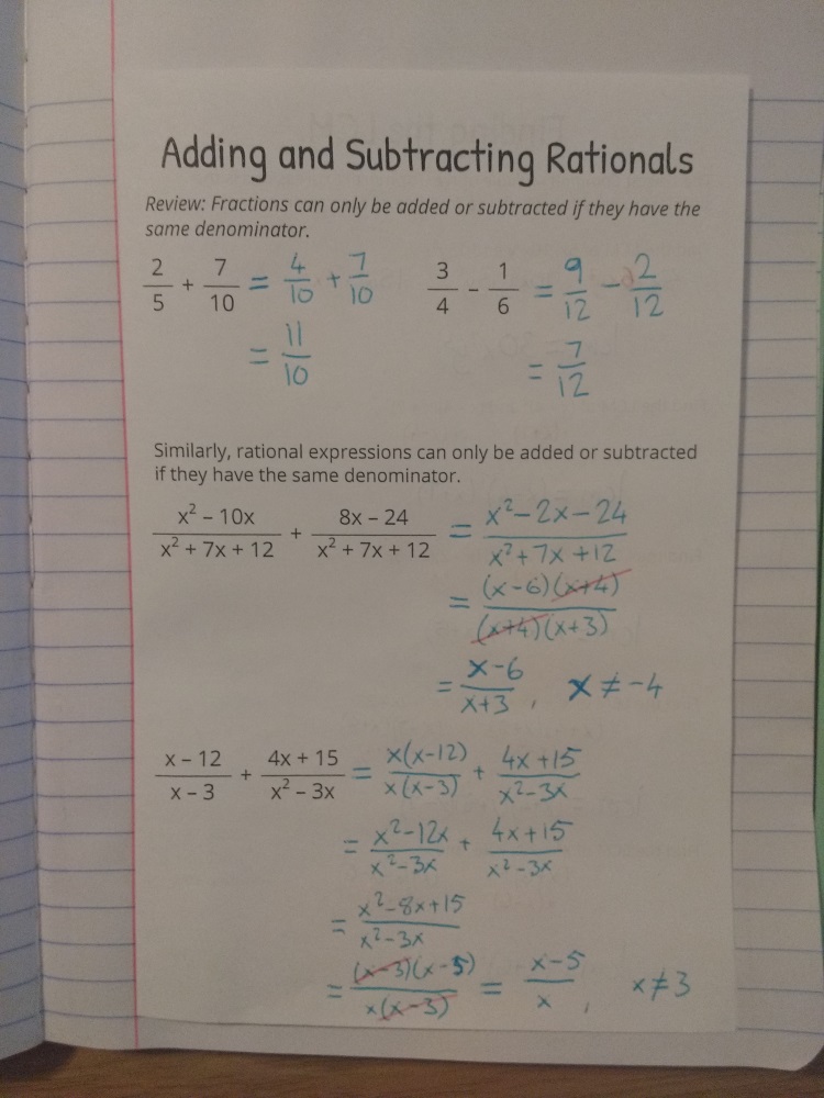
What I love about this is the way it demonstrates the differences between functions, expressions and equations, but also shows how there’s a connection between them too. This poster goes well with the set Sarah created about solutions, roots, zeros and x-intercepts; that’s how she’s got them in her room, after all!
Now, the poster doesn’t capture all the particulars of these algebraic tools; it’s just a simple poster showing one example. There were some comments on twitter about the fact this poster doesn’t completely define what a function is, particularly absent a discussion of sets. Also, there was concern that the equation example implies all equations are homogeneous. Both criticisms have an element of truth, but also miss the point of a poster that, by its nature, only has one example. I think posters serve the best as either reminders of topics already discussed or starting points to launch a deeper discussion or investigation. Please, never put a poster on a wall and assume that means you’ve taught a topic. For an example of how I’ve discussed functions before, see these notes that I used in Algebra 2 last year.
This one may be a little tricky to put together, so if you want some guidance, keep reading:
- Choose your three colors. The effect works best (and helps communicate the idea) if the middle color appears to be a blend of the other two. If you don’t want to think too hard, just use blue-green-yellow like me, but I’d love to see other color combinations too.
- Print the first page (function) on the first color (blue, in my case), and the second page (equation) on the last color (yellow).
- Print either page on the middle color (green). For this page, you only need the expression rectangle, which appears on both pages. Cut off the rest of the paper.
- Stack your three pages with the expression rectangle of each page overlapping, with the middle color on top. Make sure you line up the rectangles as perfectly as you can.

